Color is the biggest element that’s used in the design. The color choice is a very important decision to make at the start of the design process, and it’s important to get it right. There are so many shades to choose from and they need to be put together in the right proportions. Otherwise, they won’t work together in harmony.
Beyond imagining how colors will look together and work in your home, it’s important to consider how they make you feel.
Color psychology is the theory that colors can affect how you feel, think and act. Color can alter a person’s mood, incite anger, evoke happiness, or call to mind feelings of indifference and sadness.
Luckily, there are a few color rules that you can use to make sure your colors look balanced every time.
Warm vs. Cool Colors
Traditionally, shades like red, orange and yellow are thought of as warm colors because they are more vibrant. However, neutrals like brown and tan are also included in the mix. On the other side of the spectrum are the cool colors, or blue, green and purple, as well as gray.
The choice of warm or cool colors will affect the energy of the space. Since warm colors tend to bring an upbeat and welcoming feel to a room, they’re best in entertaining spaces. Think about using these shades in your dining room or kitchen. Cool colors, on the other hand, are more subdued.
They work best in bedrooms and office spaces, where calming energy is appreciated.
The 60-30-10 Rule
60-30-10 is a simple decorating rule to help you choose color schemes for your home.
The 60% main color of the room includes things like your walls, your sofa, the main color of your area rug, and perhaps even your cabinets or tile (if we’re talking about kitchens and bathrooms). If you squinted your eyes when you walked into the room, this would be the predominant color you would see.
The 30% secondary color includes things like accent chairs, bedding, drapery, an accent wall, and maybe even painted doors or furniture. The main purpose of the secondary color is to provide contrast. This color will show up about half as much as the main color in your space, so think of it like a great supporting actor in a film. It’s different enough from the main color to provide interest, but not steal the show.
The 10% accent color is the fun stuff – decorative accessories, pillows, artwork, lamps, picture frames, candles, florals… It’s the pop of color you want people to see in your room. Could even be a metallic finish, like gold or brass…
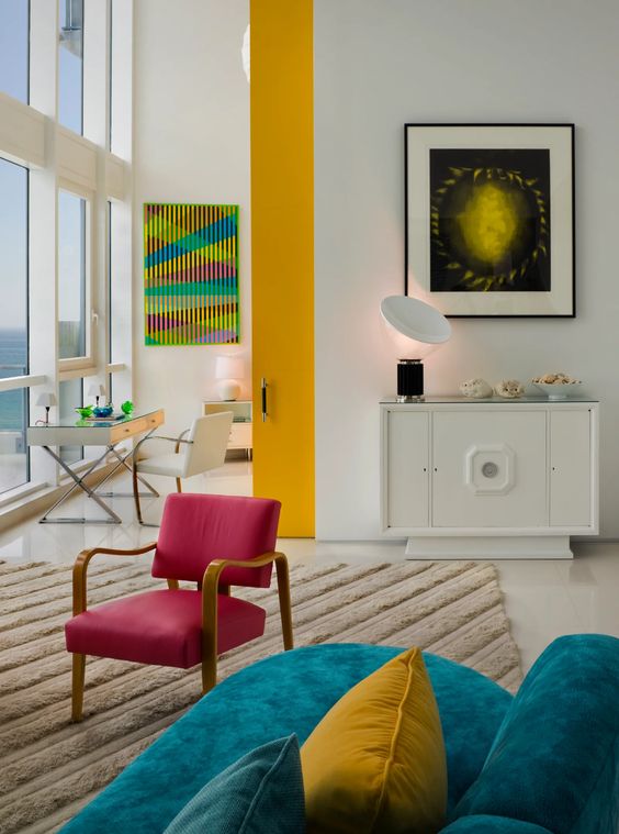
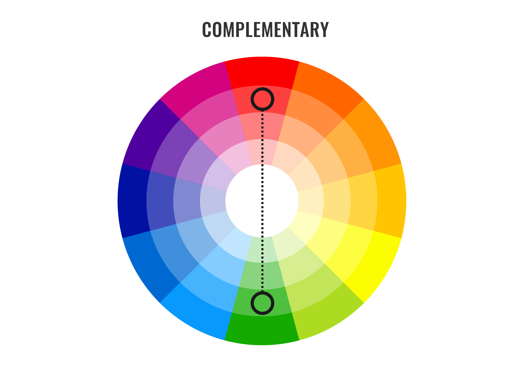
The complementary color scheme
Of all the color rules that interior designers use, the complementary color scheme is often thought of as the simplest.
That’s because this color scheme only involves two shades. In particular, it uses two shades that are sitting directly opposite each other on the color wheel, meaning you get combinations like blue and orange, yellow and purple or red and green.
As you can see from the photo, these color pairings are extremely high contrast, which means that — while they undoubtedly bring strong energy into space — they’re ultimately best used in small doses.
You should think of them as your accent colors and use plenty of neutrals to balance them out and provide a place for the eye to rest.
The Analogous Color Scheme
If you have trouble navigating the color wheel, an analogous color scheme might be for you. For this one, all you have to do is pick a central color, then also use the colors on either side of it.
Here, two colors will be primary colors and the third will be a mix of the two. For example, red, orange and yellow or red, purple and blue. Since you’re using three colors in this one, proportion will come in handy to make sure the space feels balanced.
You may want to incorporate the 60-30-10 rule again to keep your proportions in check.
And remember, you can always use different shades of the same color as another way to create visual variety. Interestingly, if you’re not a big fan of vibrant hues, you can also do an analogous color scheme using neutrals. Typically, this is referred to as a monochromatic color scheme.
So, color schemes are the most prominent component of home decor. It’s the colors that add beauty and sprinkle magic around your home. Ranging from bold to bright, you have an entire palette to experiment with.


